Custom content

HOW TO CHOOSE COLOR
Color-ville’s innovative whimsical take on choosing colors makes you think about how to find and use color combinations in a unique way, promoting a different way of seeing.
Colorville shows you how, with paint you can connect with the world around you in surprising ways. You will create little stories that make you smile when you remember where they came from. Choosing colors should be fun not a faux earnest endurance.
Our process is part colorcard part lookbook
You don’t need to see someones staged heavily enhanced photo of a room .
Don’t follow the zeitgeist use YOUR imagination not anyone else’s….we encourage you to LOOK at everything and listen to no one.
Color-ville is an Inspirational guide to help you realize great results. These pallets bring warmth, beauty, and a sumptuous ease that blend bold colors with evocative story telling.
There are 104 iconic colors showcased in their own right to help make your home look "paradoxically" effortless.
the reluctant fondness of a relais routiers
real French cafés have a palette that feels organic, unhurried, incongruous and—yes—beautiful.
Custom content

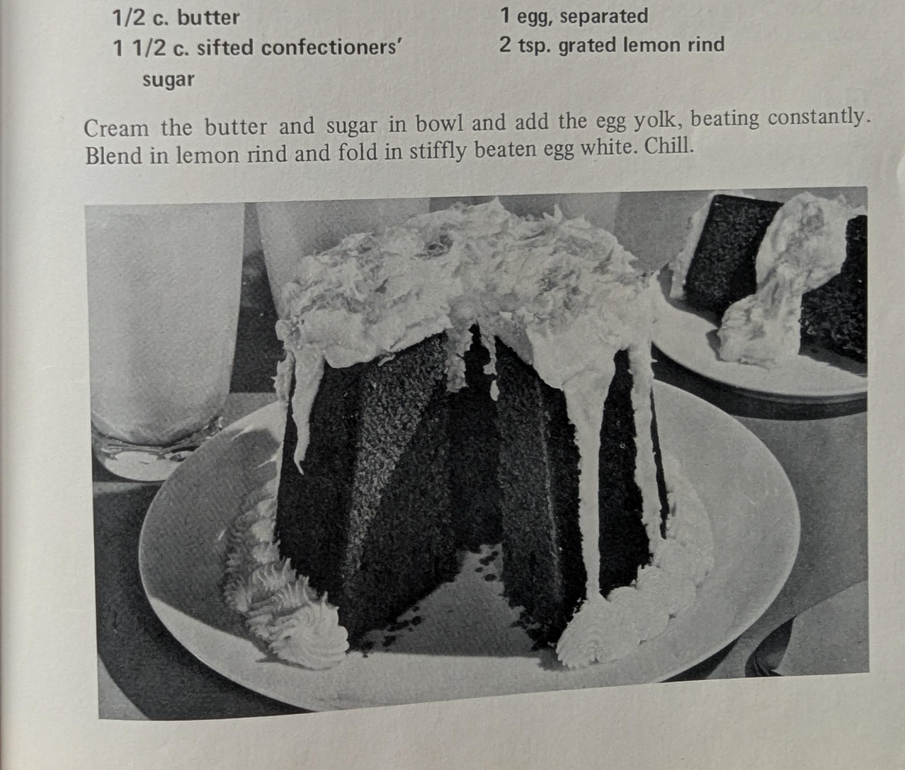
ENGLISH DESSERTS
The colors of English desserts are a peculiar, endearing parade of muted whimsy, custard yellows that blush with embarrassment, treacle browns that glisten like a damp Sunday afternoon, and jam reds that scream of overripe strawberries and unapologetic indulgence. For all their charming Englishness, these hues seem to carry the self-awareness of a man who knows he’s wearing the wrong trousers but doesn’t much care. They are colors that whisper of tradition yet laugh at their own absurdity, splashing across sponges, tarts, and trifles with a reckless, almost defiant abandon. To eat an English dessert is to taste color itself unrefined, unpretentious, and utterly, gloriously out of step. Use it with abandon, indeed.
Custom content
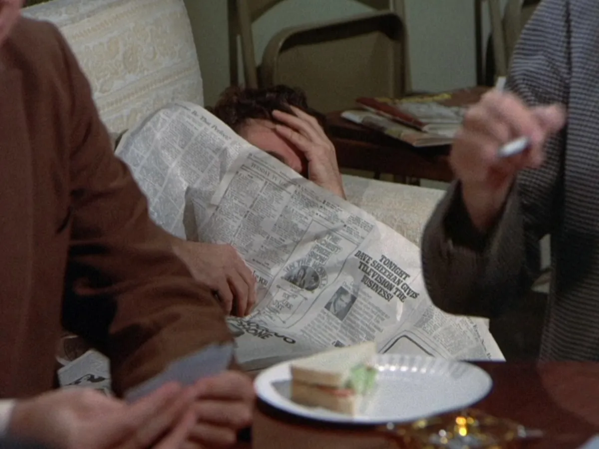
COLORS OF COLOMBO
Columbo's charm lies in his ability to blend into his surroundings, making his moments of brilliance all the more surprising. the same could be said of the 'colors of Columbo': it’s a landscape of shades so low-key, so modest, they barely seem to notice they’re there., these colours are a study in restraint, in subterfuge, in the way something so understated can speak volumes. the muted tones of observation, the palette of the underdog, the detective who is never rushed, but always gets his man or woman, eventually. The beige takes down the pink and yellow …these muted "colors" represent something deeper: the idea that Columbo, as a detective, is all about subtlety and a light touch rather than extravagant flair. His style is unflashy, and these colors reflect the unglamorous, humble life aesthetic
Custom content
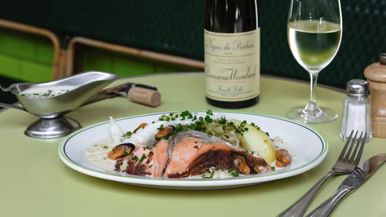
ALSATIAN CHOUCROUTE and other delicacies
The colors of choucroute are the colors of a life well-lived, of something that doesn’t try too hard to impress but quietly, unassumingly wins you over. It’s is an unassuming dish, visually underwhelming, but its an understated color palette with a few counterpoints: those muted yellows, rich browns slushy green juxtaposed with flesh pink, mild mustards speak to its deep, almost humble complexity. It’s a dish that doesn't need to impress; it simply is, and that’s
enough.
Custom content
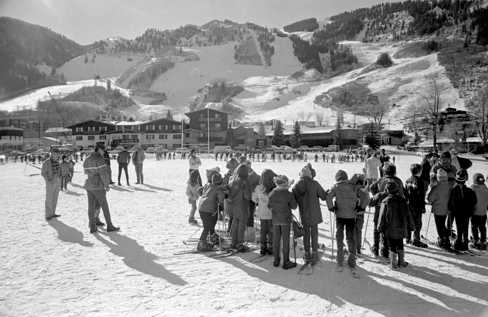
HOLIDAY RETREAT AT THE ALPINE LODGE
The colors of après-ski, are a delightful collision of the absurd and the sublime. Picture the garish neon of ski jackets—pinks and oranges so loud they could wake a hibernating bear clashing gloriously with the muted, snow-dulled greys and whites of the slopes outside. Inside, the lodge is a haven of faux-rustic charm: the burnt orange of cheap vinyl booths, the sticky brown of spilled beer on wooden tables, and the flickering gold of a fire that’s trying too hard to be cozy. There’s the blush of windburned cheeks, the deep red of overpriced wine, and the electric green of a Jägermeister bottle, glowing like a beacon of poor decisions. It’s a palette that screams both indulgence and regret, a Technicolor reminder that après-ski is less about elegance and more about surviving the day with stories to tell.
Custom content
